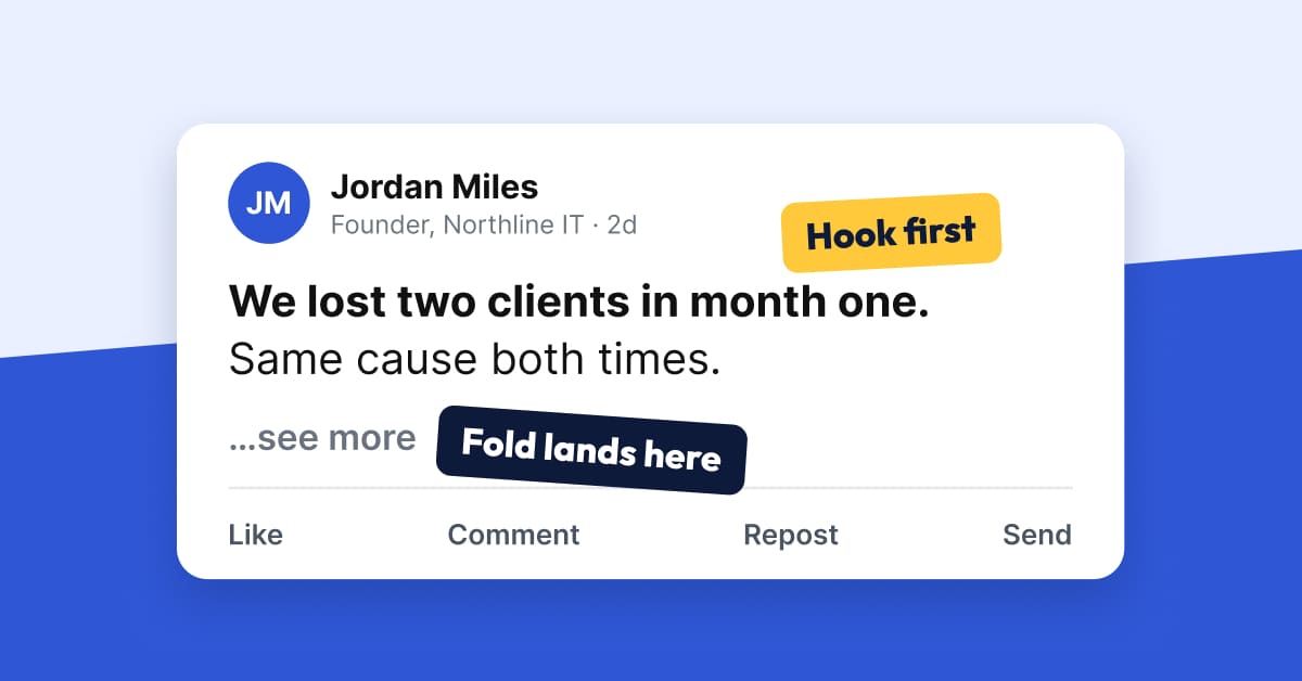
LinkedIn has no bold or italic button in the post box, so "bold" text on LinkedIn is really Unicode look-alike characters you paste in from a formatter. Use it on a few words at most, and put your effort into what actually changes how a post reads: a first line that fits the mobile cutoff, short paragraphs, and plain-text structure.
This guide shows how to bold and italicize on LinkedIn, how to space a post so the hook survives the "see more" fold, what to do about fonts, and the accessibility cost of fancy text that most guides skip. It is written for SaaS founders, MSP and cloud partner leaders, professional firms and anyone running founder-led LinkedIn sales.
How do you bold text in a LinkedIn post?
You paste Unicode bold characters. LinkedIn does not support rich text formatting in the post composer, as one LinkedIn Pulse article on post formatting puts it directly: "LinkedIn doesn't natively support rich text formatting." Free converters swap your letters for mathematical-style characters that look bold, italic or monospace in the feed.
The steps take under a minute:
- Write the post in plain text first. Finish the draft before you style anything.
- Pick the two or three words that carry the point of the post.
- Paste your draft into a formatter such as the free LinkedIn text formatter, highlight those words, click Bold or Italic, and copy the result.
- Paste it into LinkedIn, then preview the post before you publish.
The same method works for italics. Pick the style, convert the words, paste them back. Bold and italic are the same trick with a different alphabet, which is why a search for how to italicize on LinkedIn lands on the same tools as how to bold text.
What does LinkedIn actually let you format?
Less than most people assume. Here is the split between what is built in and what is borrowed.
What is the 3,000 character limit, and where does "see more" cut your post?
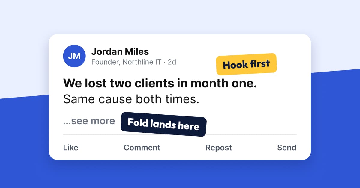
A LinkedIn post holds up to 3,000 characters, per LinkedIn Help. But the number that decides reach is much smaller: the point where the feed folds your post behind "see more."
LinkedIn does not publish that cutoff. Two outside measurements, PostFormatter and Content Drifter, both report roughly 210 characters on desktop and roughly 140 on mobile, with a cap of about three lines. Whichever limit runs out first wins, and blank lines count as full lines. These are third party measurements of a layout behavior, so treat them as a working range, not a rule.
Mobile and desktop figures are third party measurements. LinkedIn publishes only the 3,000 limit.
That gives you a simple formatting priority:
- Write the whole hook in the first line.
- Keep that line near 140 characters so it survives on a phone.
- Do not spend line breaks early. A one-line opener, a blank line and a second short line can use up the three-line allowance before you reach the point.
What does a post look like before and after formatting?
Here is a founder post written two ways. The facts are identical. Only the structure changes. This is an illustrative example, not a real post or real results.
Excited to share some thoughts today about how we handle client onboarding and why it matters for retention in our business.
We have learned a lot over the years and I wanted to put it all in one place...
...for anyone who might find it useful. Onboarding is a big part of keeping clients and there are several things we do differently now than we did before and I think it has made a real difference for the team and for clients alike.
We lost two clients in month one. Same cause both times.
Neither one knew what happened in the first 30 days.
So we changed onboarding to three steps:
1. A kickoff call in the first 48 hours
2. A one-page plan the client signs off on
3. A check-in at day 14, before anything slips
Month one retention is now the first number we review.
What is the first thing your new clients hear from you?
On mobile, the "before" fold lands mid-sentence and the reader still has not learned anything. There is also no structure to scan. What changed in the "after" version, and why:
- The hook moved into the first line. A short, specific opener fits inside the mobile window and gives a reason to tap "see more."
- One idea per paragraph. Each paragraph is one to two lines, so a phone screen never shows a wall of text.
- The list is typed, not styled. Plain numbers work for every reader and every device.
- No bold at all. If you add it, bold only the 3 words of the numbered step that matter, not whole sentences.
How should you space a LinkedIn post?
Use a short paragraph rhythm: one to three lines per paragraph, with a blank line between. That keeps the post readable on a narrow phone column, and it follows the same logic as the fold: the feed counts rendered lines, not sentences.
A spacing template you can reuse:
If you need a starting structure, the LinkedIn post templates guide has formats you can drop this spacing into.
One practical point on length. Spaces, blank lines and line breaks all count toward the 3,000 characters, and a post with lots of short lines uses the allowance faster than dense paragraphs. Styled Unicode letters can also count differently from plain letters, so recheck your count after formatting, not before. A formatter with a live character count helps here.
What about LinkedIn fonts and font generators?
A LinkedIn font generator does the same thing as a bold formatter. It maps your letters onto another Unicode alphabet, such as script, double-struck or monospace. LinkedIn does not change the typeface of your post. What you see is a different set of characters, not a different font.
That has three consequences:
- Rarer decorative alphabets can look inconsistent on some devices if the device lacks a glyph for that character.
- Decorative alphabets are harder to read, especially for people with dyslexia. A web developer's write-up on fancy fonts lists this alongside display bugs and search problems.
- Script and gothic styles rarely suit a founder or firm voice. For a buyer deciding whether to trust you, plain text reads as more credible than ornate text.
If you want one styled element, a single bold phrase is the safest choice. Skip the script alphabets for anything a buyer needs to read.
Does fancy formatted text hurt accessibility and search?
Yes, it can, and this is the part most formatting guides leave out. Unicode bold is not bold text. It is a set of mathematical symbols, and assistive technology treats it that way.
Accessibility consultant Adrian Roselli tested fake bold and italic with several screen readers. In his recordings, JAWS 2025 announced each styled letter individually, including its case and style, while NVDA did not announce the fake bold or italic words. His conclusion is to avoid fake bold or italic on social platforms, LinkedIn included.
A second write-up gives an example of the effect: a sentence with a styled "not" can be read aloud without that word, which flips the meaning of the post. That is an extreme case, but it shows the risk when a key word is styled.
The same warning appears on SocialPost.ai's own formatter page: screen readers and search can miss Unicode styles, so format a few words, not whole paragraphs. The practical rules:
What formatting works best for each type of founder post?
The right amount of formatting depends on the audience and the job of the post.
What should you check before you publish?
If you write posts weekly, build this checklist into your routine instead of reformatting each draft by hand. SocialPost.ai drafts fresh on-brand LinkedIn posts every week. You can edit anything, and nothing goes live until you log in and approve it, so formatting is the last check, not a second job. If you want to schedule what you approve, see how to schedule posts on LinkedIn.
Frequently asked questions
How do I bold text on LinkedIn?
LinkedIn has no bold button in the post box. Convert the words with a Unicode text formatter, copy the result and paste it into your post. Keep it to a few words.
How do I italicize on LinkedIn?
The method is the same as bold. Pick the italic style in a formatter, convert the words, then paste them into the draft.
Does LinkedIn support bold and italic natively in posts?
Not in the standard post composer. The styled text you see in other people's posts is Unicode characters pasted in from an outside tool.
Is formatted text bad for accessibility?
It can be. Some screen readers read each styled letter aloud as a math symbol, and others skip the styled text. Avoid styling the words that carry meaning, and rely on spacing and structure.
How many characters can a LinkedIn post have?
Up to 3,000 characters, according to LinkedIn Help. Only the first part shows before "see more," roughly 210 characters on desktop and 140 on mobile in third party measurements.
Can I change the font on LinkedIn?
No. A font generator swaps your letters for other Unicode characters. The typeface of the post does not change, and decorative styles can be hard to read.
Do line breaks affect the "see more" cutoff?
Yes. The feed folds a post by characters and by roughly three lines, and blank lines count as lines. Avoid spending line breaks before your hook lands.
How do you start with a draft you only have to approve?
Good formatting is mostly structure, and structure is easier when you start from a clear draft. Try SocialPost.ai free: log in, approve, and your on-brand posts go out. And when you want to style a few words, the free LinkedIn text formatter is there, with a live preview and character count.